Think Your Web Design is Exciting? This Algorithm Will Tell You

I recently bumped into a startup’s website, that claimed it could instantly measure your website design clarity and how exciting it was. Berlin based technology company, EyeQuant is leading the way in this amazing new software. It got me intrigued so I contacted them to learn more.
Kurtis Morrison, VP Client Services from EyeQuant was very helpful and explained this incredible new technology and also provided some screenshots of how it works, using our own website to demonstrate. In simple terms, here’s what EyeQuant does.

Clarity Score
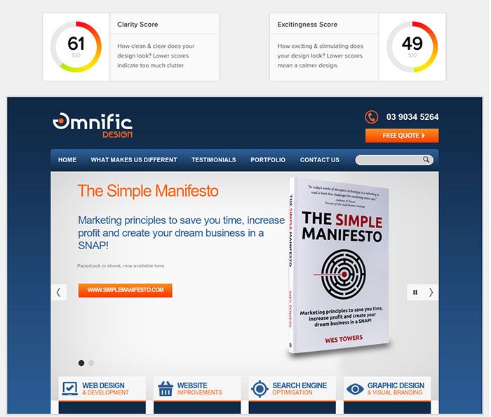
EyeQuant measures the clarity of your website design, giving you a score out of 100. Our homepage scored 61 which means it’s better than average. This indicates the design is cleaner than the average page on the internet (avg =50). Most home pages score between 40 to 60. Kurtis highlighted that “clarity” in this sense refers only to visual clarity, not clarity of the marketing message.
He also suggested a higher score is better, but context is more important. For example, you shouldn’t be striving for a 100, you should be striving for a high score relative to:
- Your industry
- Your direct competitors
- Previous iterations of your design.
Many of EyeQuant’s customers use the Clarity Score for benchmarking or internal quality control.
Here are some examples of “high clarity” home pages
Excitingness Score
Our excitingness score was 49 out of 100, which is average. Again, this is just a simulation of visual judgments – EyeQuant doesn’t evaluate the appeal of your offer, for example.
Excitingness is more subjective than clarity, the desired score depends a lot on your target audience and what they engage with best. It will depend on how you want to be positioned. If you are a ‘rockstar’ style business, you probably want to be more exciting than if you want to be seen as a ‘dependable friend’. Likewise, if you’re selling skateboards, you probably want an exciting design (a high-score). If you’re selling life insurance, you probably want something a little more conservative (and thus a lower score).
Here’s some great examples of websites with high “Excitingness Scores”.
Perception Map

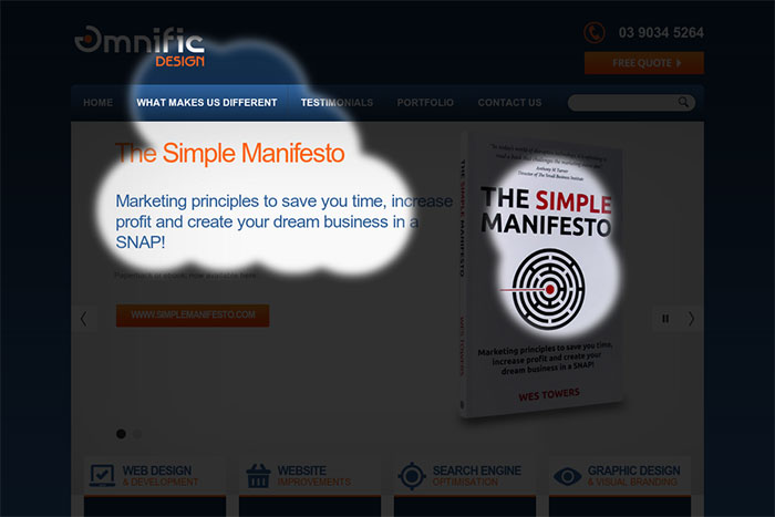
The perception map shows what content users are likely to see and miss during the first 3 seconds after landing on the page. Ideally, you want the “spotlight” to fall on your key messages. A useful framework for this is the 3 W’s: you want to instantly convey:
- What the page is about
- Why users should care
- Where they should go next.
Ours shows “What makes us different” and details about my book, The Simple Manifesto, which I am very happy with.
Attention Map

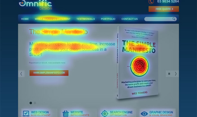
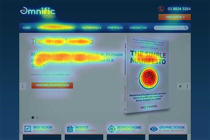
This is based on exactly the same data as the perception map, but the heat map format offers a more granular view into the data, which helps you understand which areas of the page are most and least eye-catching. This is a handy way to identify distractions, for example.
For our homepage, this shows the icon on the book cover design is very strong. I’m hoping this means it stands out in bookstores too.
General info
Kurtis was very helpful in sharing with us some key points of what EyeQuant is for and how it should be used:
- EyeQuant’s goal is to make design instantly measurable. To do that, they have built software that simulates human visual perception. With EyeQuant perception/attention maps, clarity, and excitingness metrics, they are able to provide results that are 85 to 95% as accurate as conducting a comparable user study with real people.
- The software analyses image files, not code, so customers can upload both live sites as well as mockups & prototypes (desktop or mobile) and get feedback prior to building the website.
- EyeQuant is currently only able to analyse above-the-fold designs (i.e. the stuff people see right away)
- EyeQuant have hundreds of customers including brands like Nike, Priceline, Epson, and British Gas.
- EyeQuant is normally used as a way to generate or validate ideas for A/B tests.
You’ll find some great case studies here:
Anything else you’d like to know? Please ask in the comments below.

